An interesting read
For next level design inspiration, insights, advice and #TeamLaunch news, check out the articles written by the team below.

Ways to make your portfolio standout to employers
When it comes to designing your portfolio there are many things you can do to elevate it and make it stand out from the crowd. In this article we have listed five steps that we think can help you create the best portfolio that reflects you and your work and catch the attention of a potential employer.

Typefaces and feelings
As discussed in our previous blog post tackling the topic of Comic-Sans, typefaces are designed for specific contexts and purposes. A type designer will take into account the size and medium in which a typeface will be used to inform the design process. There is another aspect that informs the design and choice of a particular typeface and this is its ‘feel’.

Comic Sans is misunderstood
As a designer you often get asked the same questions, one of those being ‘what do you think of Comic Sans?’. The general consensus, it seems, from non-designers is that Comic Sans is an inherently bad typeface. I would argue however that is not, it is just misused.

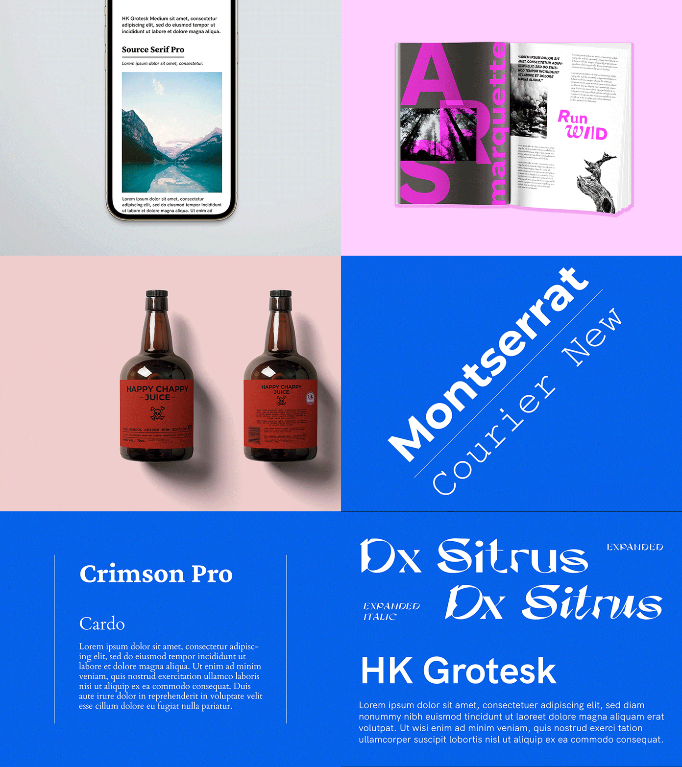
5 font pairings for 5 different projects
As graphic designers, the use of typography is fundamental in our practice. It can elevate our designs from simply art, serving both aesthetic but functional merit. In this blog we look at some of the recent font pairings we’ve enjoyed experimenting with.

The psychology of colour
Did you know that colour increases brand recognition by up to 80%? It can be used to make a statement, draw attention, create engagement, set a mood… the list goes on. It can affect our behaviour, but, above all, it influences how we interact with a brand.


