The art of rebranding: lessons from iconic case studies
A rebranding project is when we look to change and refresh a brand’s identity to alter how the brand is perceived in the minds of its consumers, as well as the company as a whole.
We’ve been exploring what some of these iconic rebrands teach us.
AirBnb
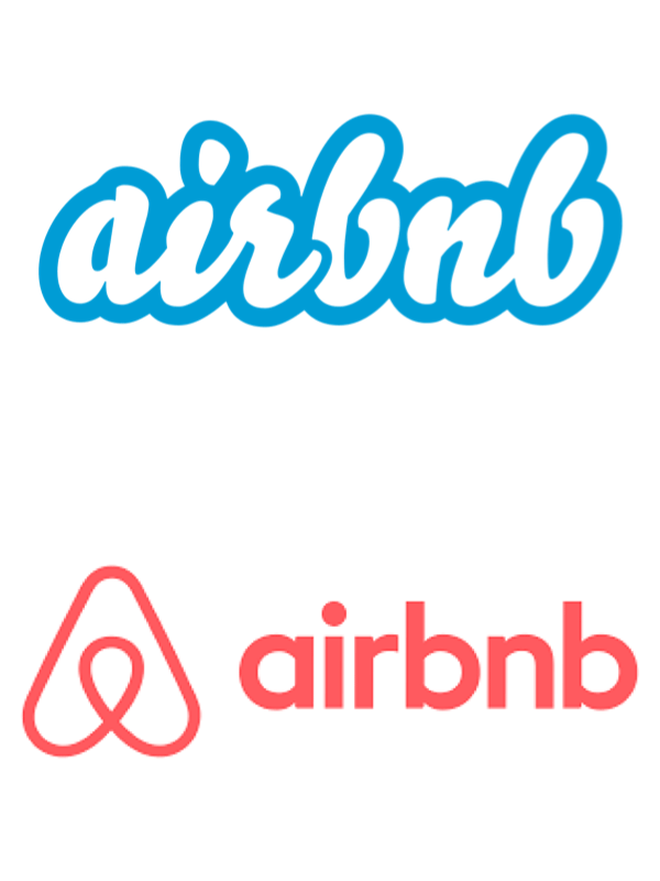
A great example of a hugely successful rebrand is Airbnb by DesignStudio. Although it has now been 10 years, the rebrand is still a massive success story. They wanted to convey that it was more about the people than the places and how you are fully immersed in the culture, and this was not reflected in their old identity – it was more about just having a place to stay. Their old logo felt quite generic and didn’t have any strong recognisable qualities. The blue and white scripted logo was weak and didn’t represent the passion that Airbnb hosts are celebrated for worldwide.
The new ‘Belo’ logo represents a person, geotag and a house. Belo comes from the words ‘belong’ and ‘believe’. This reinforces the qualities of it being community-driven and enables people to ‘Belong Anywhere.’
The ‘Belo’ logo has now become recognisable worldwide which has a comforting familiarity. The warm colours and typeface transform the user from feeling like they are a stranger in an unknown place, and captures the special connections Airbnb hosts make with their guests.
Recently, in collaboration with Buck Animation, they have created a series of eye-catching animated activations in their adverts that celebrate having a place that caters just for you – instead of a hotel. After the pandemic, they felt that there were lots of competing options and they were losing their uniqueness. Through the animations, Airbnb reinforces what makes them the best choice – as well as taking the viewer through a story that everyone can relate to.
Even after 10 years, Airbnb is still innovating and growing which allows them to continue being stand out industry disruptors.
Kleenex
A more recent example is the kleenex rebrand, by Turner Duckworth, which reinforces their leadership in the industry and modernises a brand which is now 100 years old.
Inspired by ‘a mean case of the sniffles’ Kleenex have injected life into their branding, allowing it to have some personality which everyone can identify with.
Turner Duckworth have reinforced the crown motif but adapted it to reflect the shape of the product. Combined with a serif that can fluctuate in shape and size to reflect a sneeze, the colours and effect of the text symbolise the softness of a tissue. This creates a comforting presence that adds a new emotional layer to their brand recognition.
This shows that for a successful rebrand is it important to reflect on what your brand is most used/ recognised for and how you can capitalise on that to modernise and fortify your brand recognition.
Center Parcs Europe
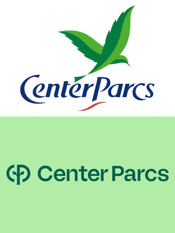
Center Parcs Europe have over 29 establishments. They wanted to reinforce the connection between nature and humans which is what makes them unique. Primarily being a place for families, the rebrand aims to appeal to all ages whilst still creating a comforting and natural visual which can be applied easily to each unique location.
In contrast to the outdated logo which felt less inclusive, the new logo helps to unite all collateral which is applied to all aspects of the parks, creating a united experience for their guests. This reinforces the power that nature has to connect us back with each other. The new typeface is circular, feeling organic and alive, and paired with bright colours which help to capture attention of all ages and invigorate the flexibility of the branding. The use of both bespoke photography and illustration adds humanity whilst also demonstrating the fun activities that make the Center Parcs experience. The free-flowing style of the illustrations also create a calm and welcoming presence throughout the parks, again helping to complete the overall overhaul of their image.
This shows once again that a rebrand needs to be something that grounds your brand ideals whilst reinforcing what you are most well-known for.
One of the key takeaways to note is that all of these rebrands have tapped into the emotional connections they have with their audience, and what they think matters most to them. So, whether you’ve been around for 10 years or 100, the ever-changing landscape means there is always opportunity to reevaluate your visual identity.
With new brands emerging all the time it’s important to stay on top of how you’re presenting yourself externally, as well as reconnecting internally with your brand values to ground and reinforce your purpose and vision.
Ask yourself:
Does my branding say what I need it to?
Does it truly reflect my service or product?
Does it align to my ideal target audience?
How does it make my customers feel?
And if you’re unsure – simply get in touch. It’ll allow you to focus on your business and doing what you love, and we get to do what we love, a win win situation!


